Woofie’s Pal-Dog Daycare Center
About the Brand
Woofie’s Pal is a dog daycare center and spa in Ho Chi Minh, Viet Nam. As a dog lover, Woofie’s Pal owner has realized this issue is problematic for many dog owners. They are so busy working that they have little to no time to take care of their dogs and family, let alone have fun. Oscar wants to bring a solution to that because both us humans and dogs deserve the love and the joy our life has to offer.
Struggle
Woofie’s Pal is located in the Thao Dien area, district 2, attracting many foreigners to stay and work. This is a profitable customer group for most businesses in the Thao Dien area, and Woofie’s Pal is not an exception. Furthermore, at least three dog daycare centers and hotels are running within a small space by the time Woofie’s Pal opens. Under the pressure and competitive landscape, Woofie’s Pal recognizes the need to change a whole business concept from the name to visual communication systems.
Solution
Though Woofie’s Pal’s competitors have existed for a while, they focus less on building a good brand. Therefore, Woofie’s Pal takes this opportunity to adapt to a new system, including a new brand logo, typography, color, and cohesive guide for digital and printed advertising material. As a result, Woofie’s Pal successfully raises awareness in the audience and stands out from other competitors.
SCOPE OF WORK: Visual Identity, Illustration
PHOTO CREDIT: Oscar Tu
From 07/21 to 07/22
Culture
Friendly / Joyful / Giving / Welfare Care / Professional / Creative
Brand Attributes
Customer
Sympathetic / Sentimental / Relief Worry / One big family / Loved
Feel
Energetic / Secure / Educative / Supportive / Happiness
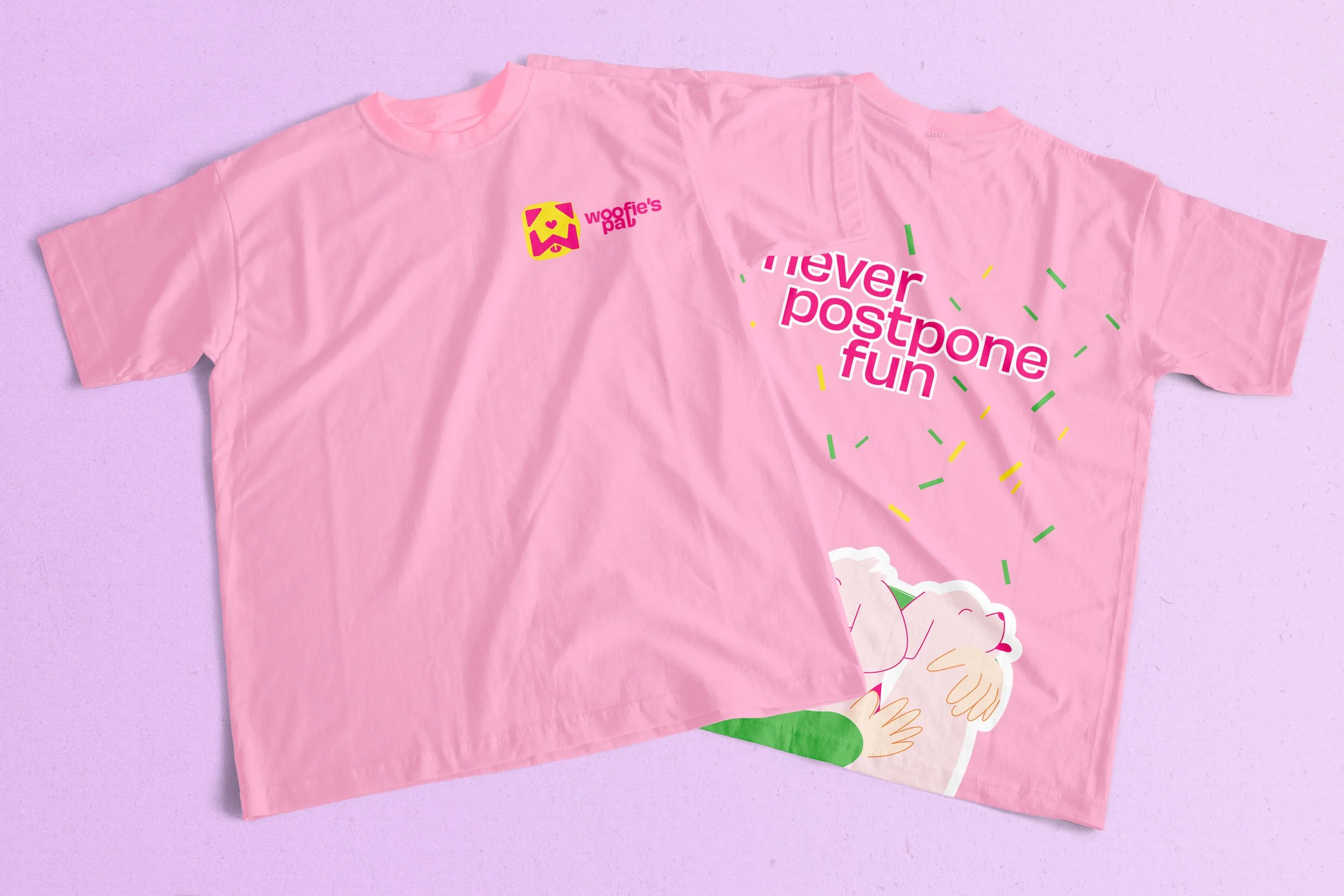
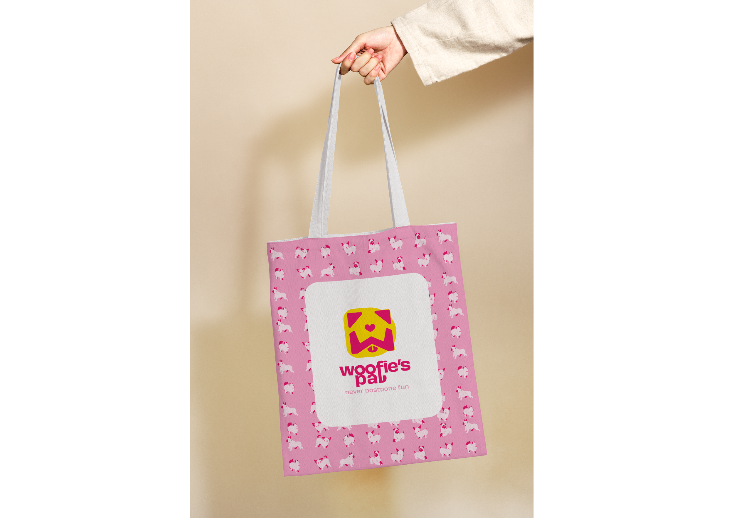
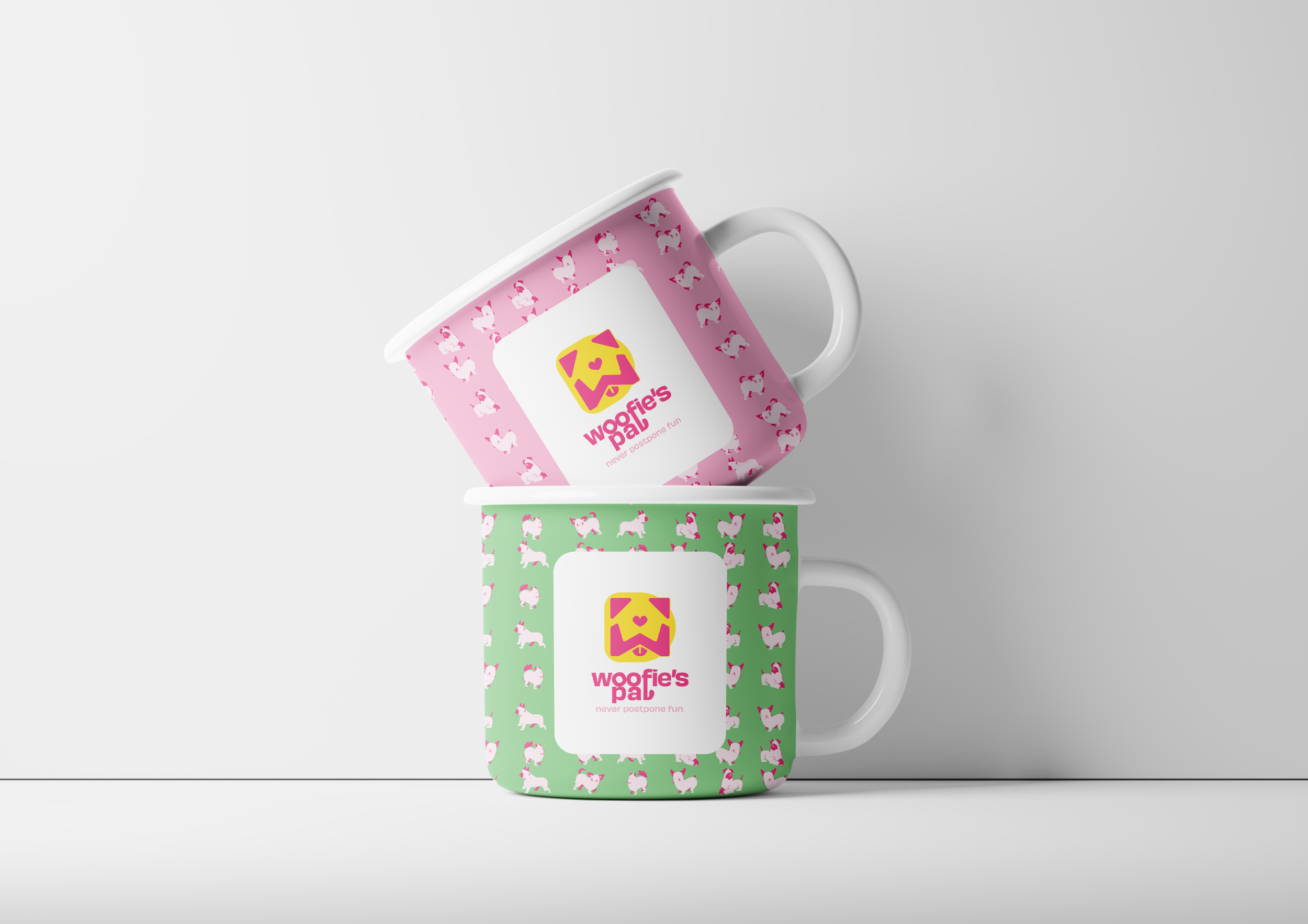
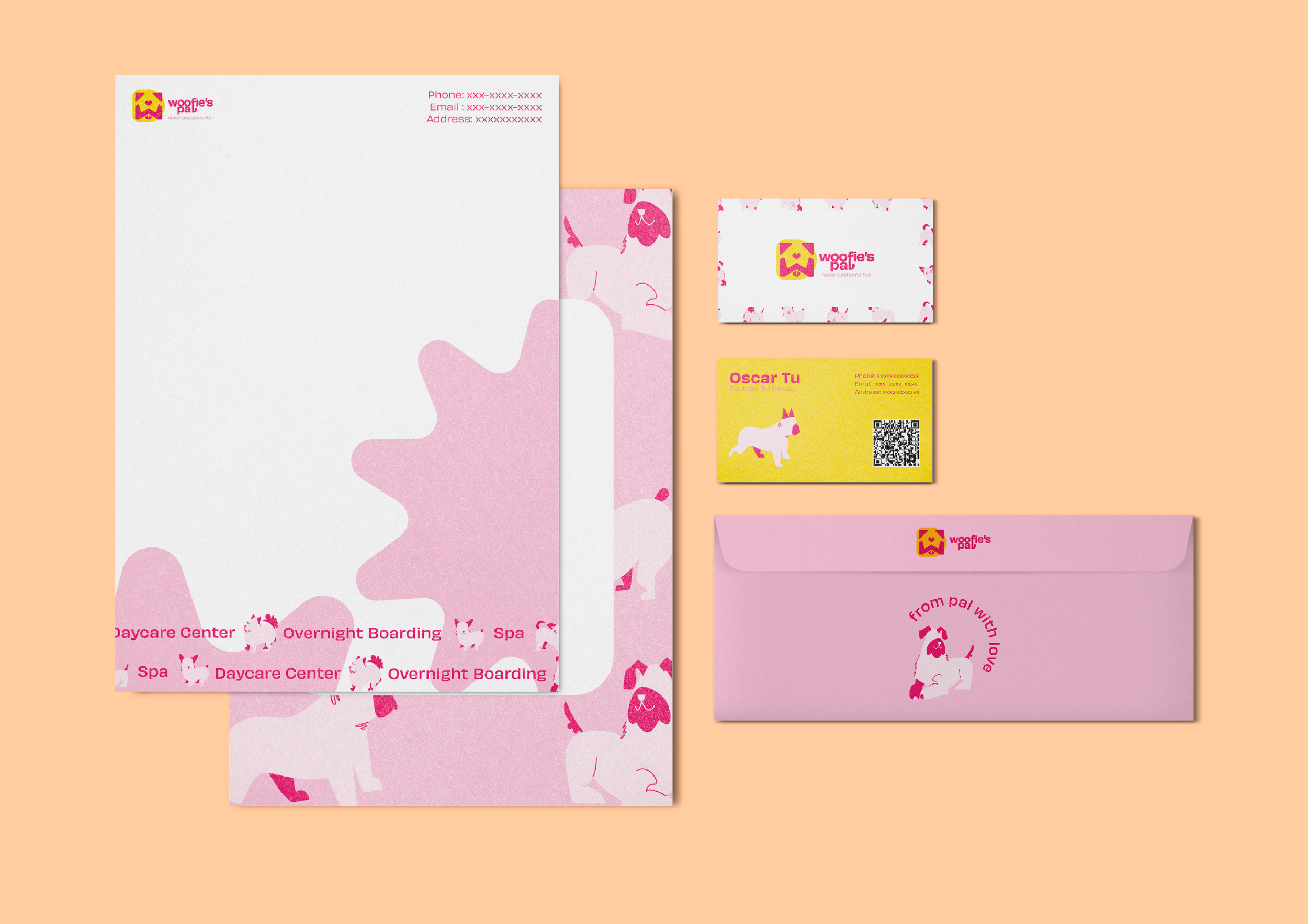
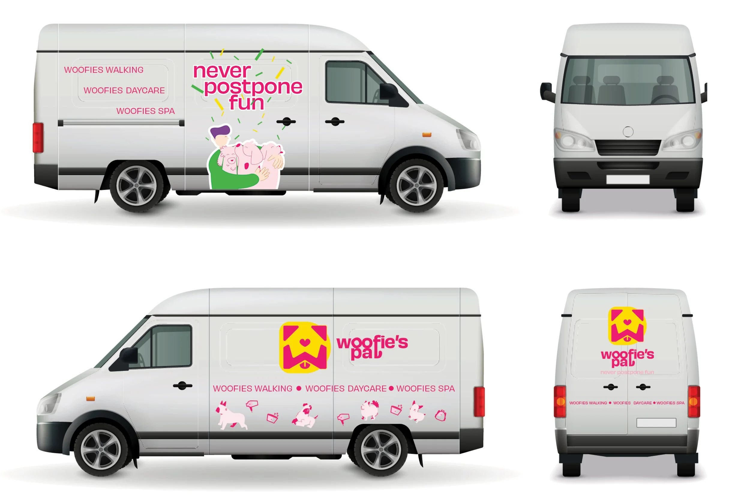
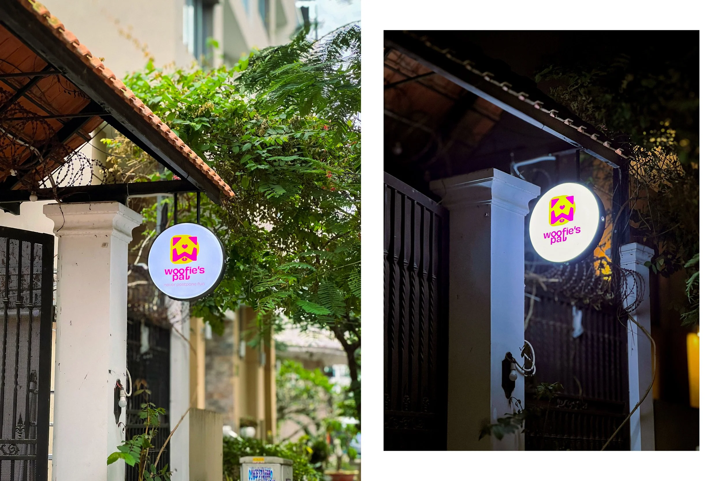
Logo Design

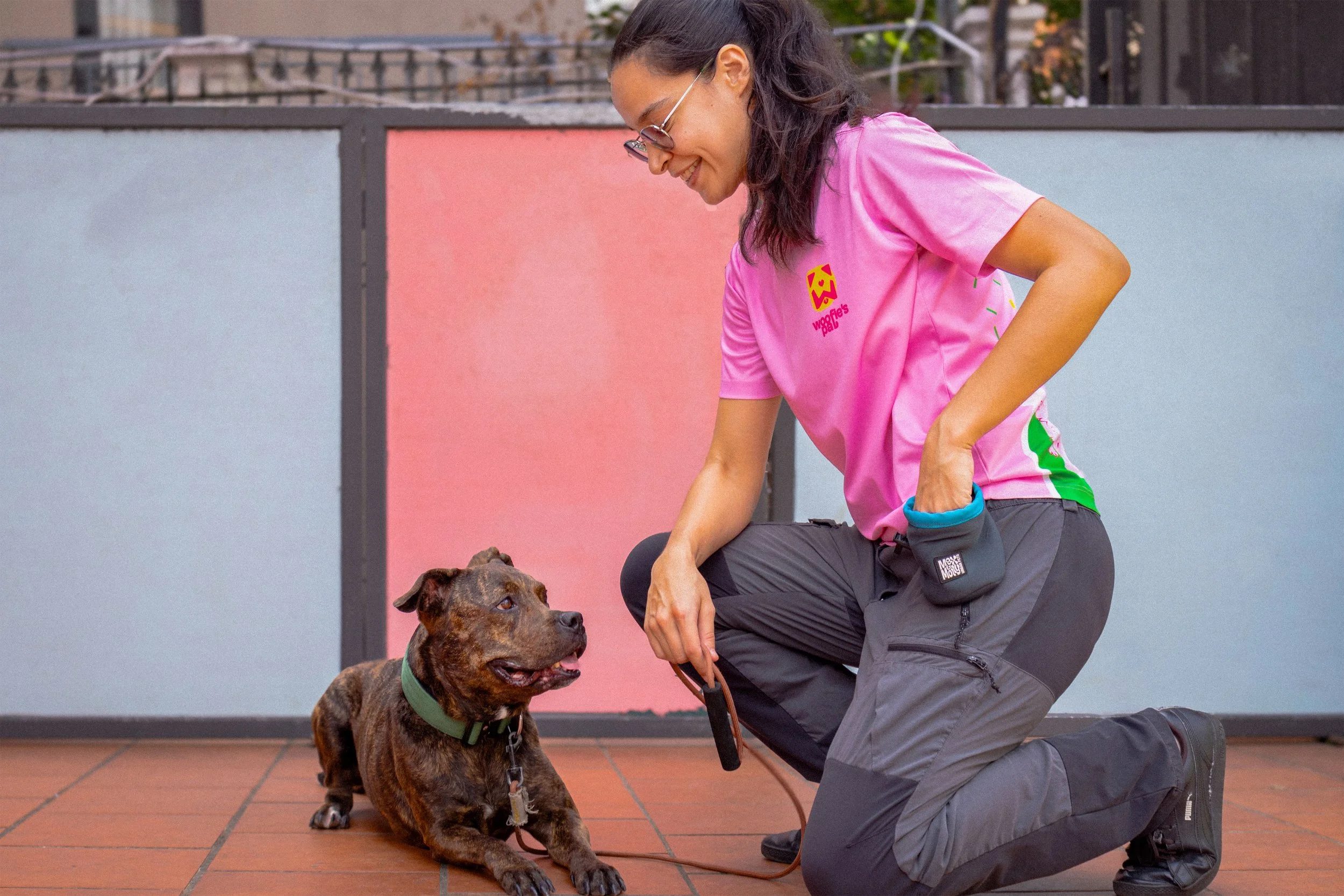
Unlike any daycare center, besides the connection between dogs and humans, Woofie’s Pal (WP) cares about turning the center into a real-home environment for dogs to have fun. When dogs stay with the WP team, they find the connection as if the team is their second parent.
Thus, the logo has to feature how Woofie’s Pal team and dog can stay connected as a family in a flexible scaling system. Taking the dog image as a foundation shape, the designer manages the negative space to introduce the form of the house, then replaces the dog’s nose with the heart icon. The idea is to introduce the dog service, then the brand’s philosophy: a home with joy and love.
Logo Clear Space
Logo Scalable System
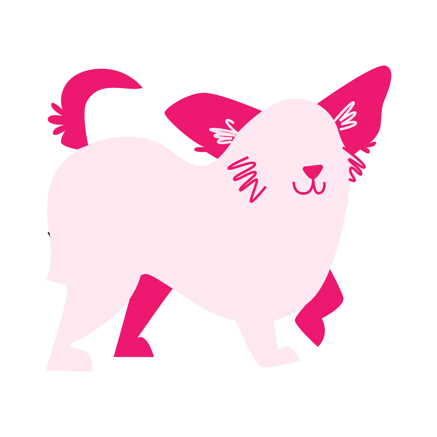
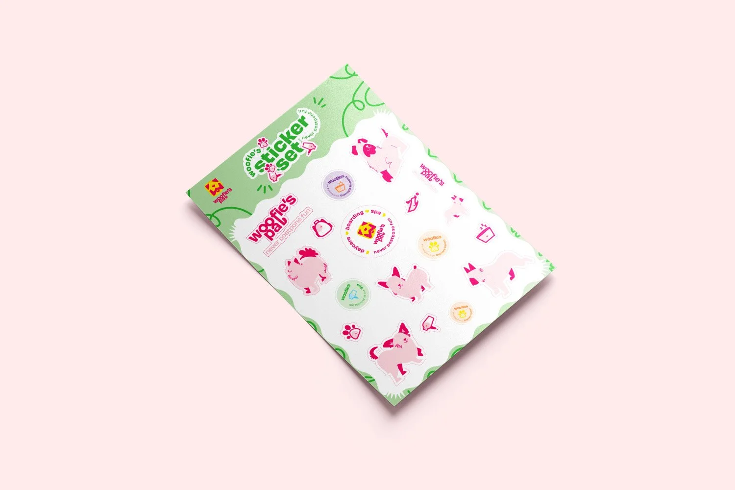
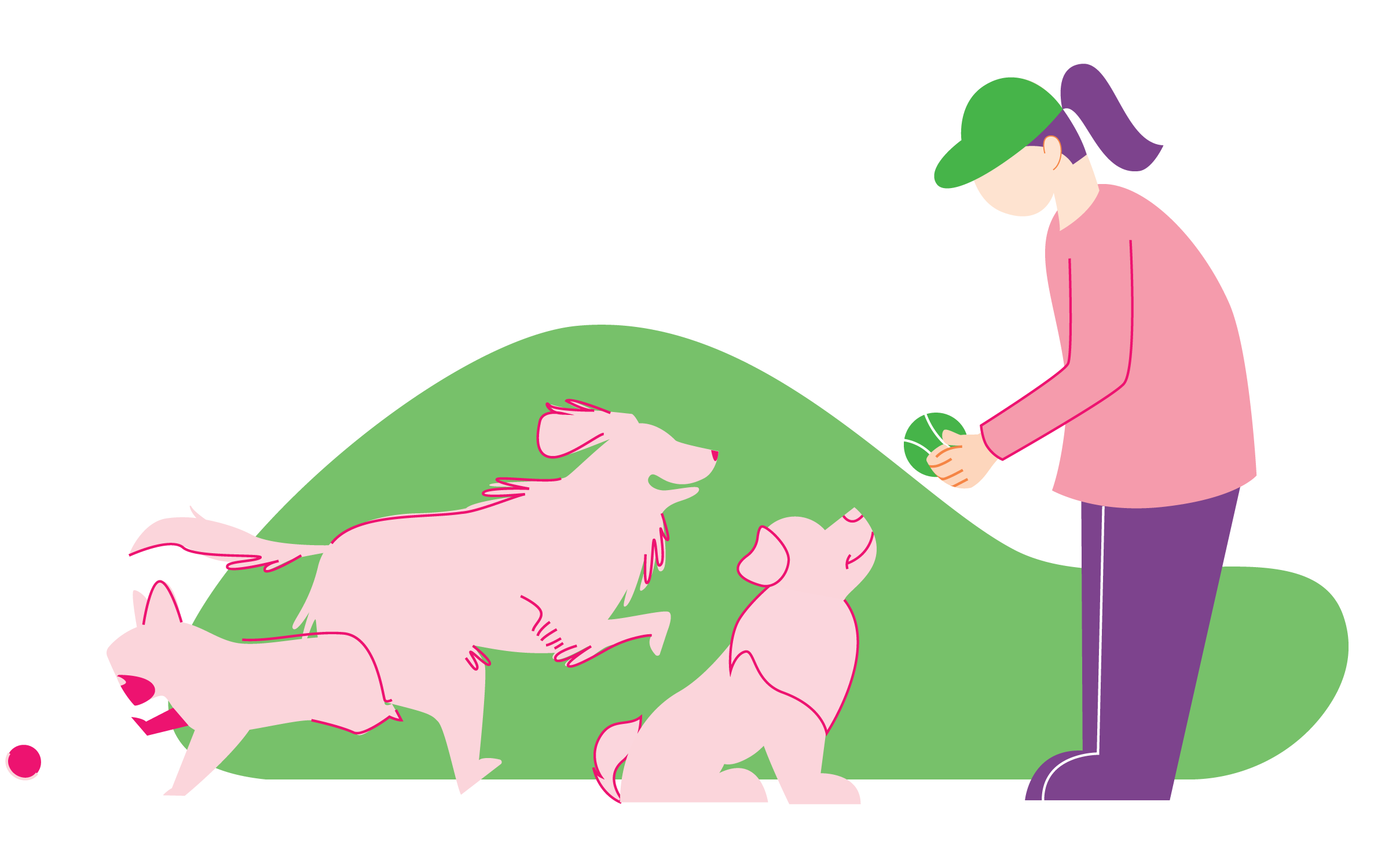
Illustration


Iconography
Voice
Supportive / Educative / Encouraging / Exciting / Friendly
Impact
Educated / Valuable / Supported / Welcomed / Love